
This tutorial demonstrates how to plot the cosine function cos(x) in Python using Matplotlib and NumPy, creating a clean cosine wave graph for beginners.
Matplotlib is a Python plotting library whose pyplot module makes it easy to create a cos(x) plot in Python, giving you MATLAB‑style plotting capabilities with simple code. NumPy is essential for numerical operations in Python, and here we utilize it to generate the array of x-values and calculate the cosine values efficiently. This combination is creating a wide variety of scientific and data visualizations in Python.
Generating a Cosine Function Plot
I have prepared a code which I am pasting below.
You need to import both matplotlib and numpy.
import matplotlib.pyplot as plt
import numpy as np
fig = plt.figure()
ax = fig.add_subplot(111)
x_min = -5.0
x_max = 5.0
y_min = -1.5
y_max = 1.5
x = np.arange(x_min, x_max, 0.10)
y = np.cos(x)
plt.xlim(x_min, x_max)
plt.ylim(y_min, y_max)
plt.plot(x, y)
grid_x_ticks_minor = np.arange(x_min, x_max, 0.25 )
grid_x_ticks_major = np.arange(x_min, x_max, 0.50 )
ax.set_xticks(grid_x_ticks_minor, minor = True)
ax.set_xticks(grid_x_ticks_major)
grid_y_ticks_minor = np.arange(y_min, y_max, 0.5)
grid_y_ticks_major = np.arange(y_min, y_max, 1.0)
ax.set_yticks(grid_y_ticks_minor, minor = True)
ax.set_yticks(grid_y_ticks_major)
ax.grid(True, which='minor', alpha=0.25, color = 'b')
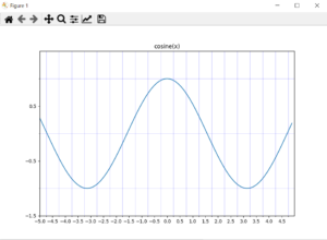
plt.title('cosine(x)')
plt.show()
This code first imports matplotlib and numpy. Then, it creates a figure and an axes object. The axes object is used to plot the data.
The code then defines the limits of the x and y axes using plt.xlim() and plt.ylim(), respectively. These limits are set to ensure the desired portion of the cosine function is clearly visualized within the plot area.
Subsequently, the plt.plot(x, y) function is invoked to generate the line plot, representing the cosine function by connecting the calculated (x, y) points.
The code incorporates both minor and major grid lines using set_xticks and set_yticks for enhanced readability.
The code then sets the title of the plot and displays it.