How to create kernel density plot in Seaborn: kdeplot() tutorial with bandwidth, fill, cut, and gridsize parameter examples.
The full seaborn.kdeplot consists from several parameters:
(x=None, *, y=None, shade=None, vertical=False, kernel=None, bw=None, gridsize=200, cut=3, clip=None,
legend=True, cumulative=False, shade_lowest=None, cbar=False, cbar_ax=None, cbar_kws=None, ax=None, weights=None,
hue=None, palette=None, hue_order=None, hue_norm=None, multiple=’layer’, common_norm=True, common_grid=False,
levels=10, thresh=0.05, bw_method=’scott’, bw_adjust=1, log_scale=None, color=None, fill=None, data=None,
data2=None, warn_singular=True, **kwargs)
I will share my knowledge to explain you parameters of kdeplot Seaborn method. It will help you to create a move advance Seaborn kdeplot.
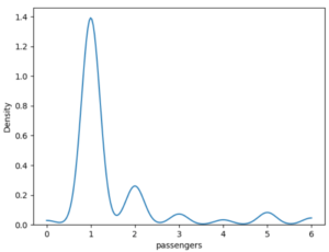
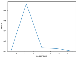
This is the completed code to create a kdeplot in Python using the Seaborn module.
import seaborn as sns
import matplotlib.pyplot as plt

df = sns.load_dataset('taxis')

sns.kdeplot(x='passengers', data=df)
plt.show()
Practical kdeplot examples: univariate distribution, bivariate contours, hue-based grouping, fill methods (layer/stack/fill), and bandwidth visualization comparison.
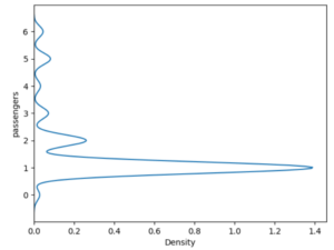
sns.kdeplot(y='passengers', data=df)
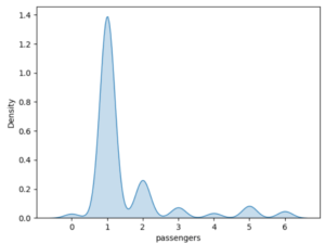
sns.kdeplot(x='passengers', data=df, shade=True)
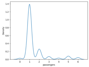
sns.kdeplot(x='passengers', data=df, gridsize=5)
sns.kdeplot(x='passengers', data=df, cut=0)