Let’s learn on how to create a BarPlot in SeaBorn Python library.
Data preparation
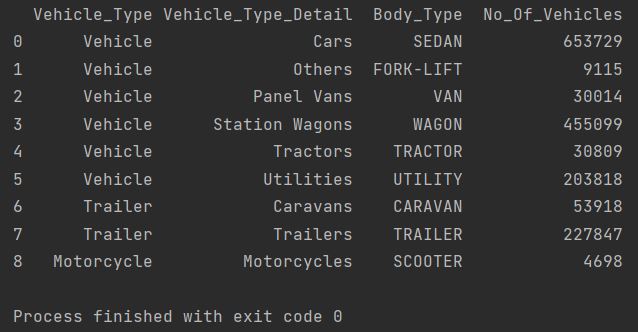
I have prepared csv file with registration vehicles data.
Let’s see the details using Pandas Python library.
import pandas as pd cars = pd.read_csv('vehicles.csv') print(cars)
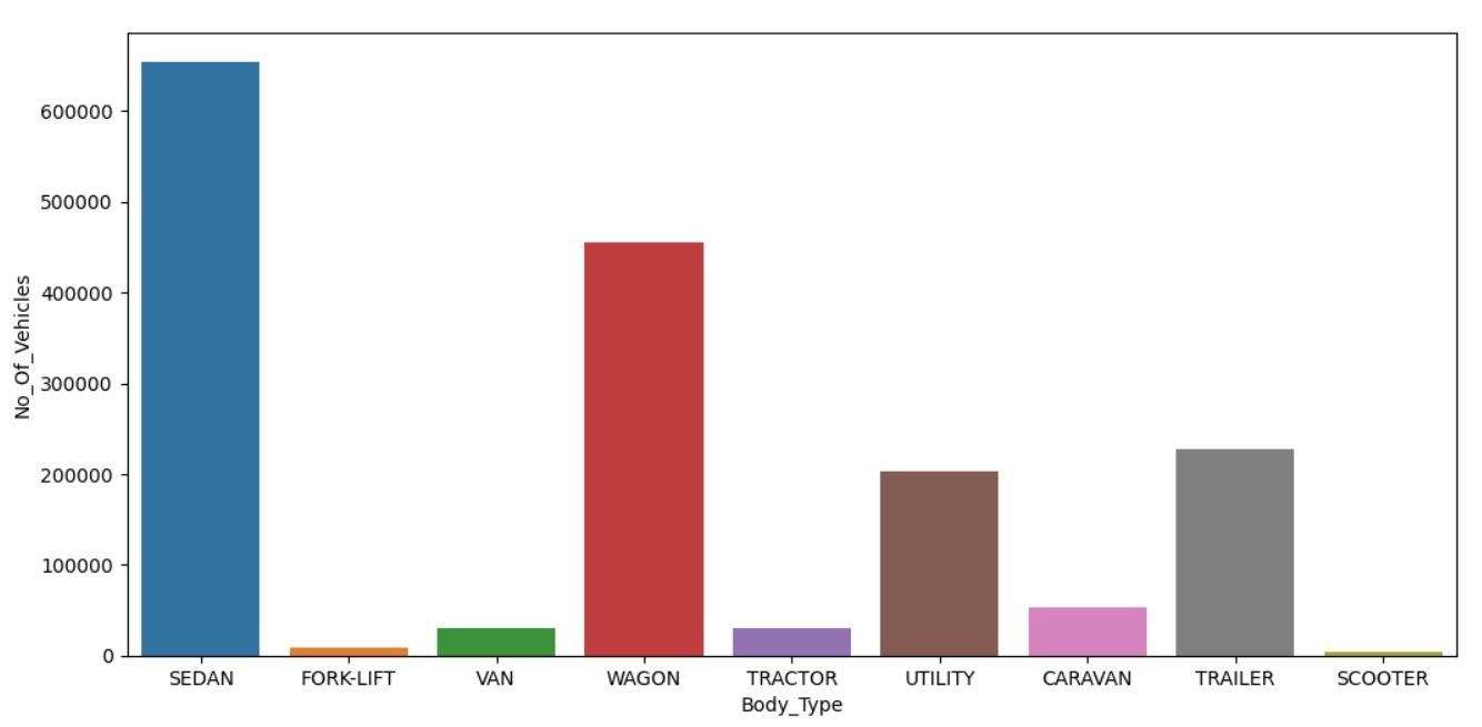
A bar graph preparation
I’d like to create a barplot chart which contains the data about the number of registered vehicles.
I need to see Body_Type and No_Of_Vehicles.
To create a basic SeaBorn BarPlot I need to import Pandas, Seaborn and Matplotlib Python libraries. To insert a barplot I am using seaborn.barplot method. As x and y I’m taking the columns I need. And data is my data source which I defined. Plt.show function will help to display the chart.
import pandas as pd import matplotlib.pyplot as plt import seaborn as sn cars = pd.read_csv('vehicles.csv') sn.barplot(x = 'Body_Type', y = 'No_Of_Vehicles', data = cars) plt.show()
Key Takeaways
- To create a bar plot in Seaborn, you can use the `sns.barplot()` function.
- The `sns.barplot()` function takes two arguments: the x-axis and the y-axis.
- The x-axis is the categorical variable, and the y-axis is the quantitative variable.
- You can also customize the bar plot by specifying the colors, the width, and the labels.
FAQ
- Q: What is Seaborn?
- A: Seaborn is a Python library for statistical plotting. It is built on top of Matplotlib, and it provides a number of high-level functions for creating attractive and informative statistical plots.
- Q: What is a bar plot?
- A: A bar plot is a type of chart that shows the distribution of a categorical variable. It is a simple and effective way to visualize the frequency of different categories.
- Q: How do I customize a bar plot in Seaborn?
- A: You can customize a bar plot in Seaborn by specifying the colors, the width, and the labels. You can also use the `sns.set_style()` function to set the overall style of the plot.