
Learn the simplest method to create a histogram using Python’s Matplotlib and Numpy libraries. These powerful libraries provide all the necessary functions for effortless histogram generation.
How to Create a Histogram in Python Using Matplotlib and Numpy
To create a histogram in Python the easy way, you only need to import Matplotlib and Numpy Python libraries. They come equipped with all the essential functions.
Let’s generate a histogram based on randomly generated numbers with the following Python code:
import numpy as np
from matplotlib import pyplot as plt
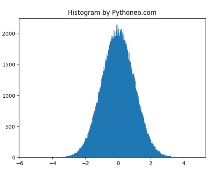
histogram = np.random.randn(1000000)
plt.hist(histogram, bins=2000)
plt.title("Histogram by Pythoneo.com")
plt.show()
We use NumPy’s random.randn function to generate a normal distribution of random numbers, which forms the basis of our histogram. Python effortlessly generates even a million numbers in seconds.
The hist function generates the histogram based on the generated data. You can adjust the number of bins to achieve the desired level of detail. It’s advisable to choose a number of bins that balances detail with readability for clearer interpretation.
By following these straightforward steps, you can create informative histograms using Matplotlib and Numpy in Python.
Customizing Your Histogram
Now that you’ve created a basic histogram, let’s explore how to customize it to suit your needs.
You can enhance your histogram by:
Changing Colors: Use the color parameter in the hist function to select a different color for your bars.
Adding Labels: Include labels for the X and Y axes using plt.xlabel() and plt.ylabel().
Adjusting Bin Width: Modify the width of the bins with the binwidth parameter.
Setting Titles: Customize the title of your histogram with plt.title().
Adding Legends: If you have multiple datasets, include legends to distinguish them with plt.legend().
import numpy as np
from matplotlib import pyplot as plt

histogram = np.random.randn(1000000)

plt.hist(histogram, bins=2000, color='skyblue', alpha=0.7)
plt.xlabel('Values')
plt.ylabel('Frequency')
plt.title('Customized Histogram by Pythoneo.com')
plt.legend(['Data Distribution'], loc='upper right')
plt.show()
Explore these customization options to tailor your histogram precisely to your analytical needs and enhance data visualization. Matplotlib offers a wide range of customization possibilities to make your histogram visually appealing and informative.