
Learn how to create bar charts in Matplotlib with customization options for colors, labels, legends, and styling.
Inserting a bar graph
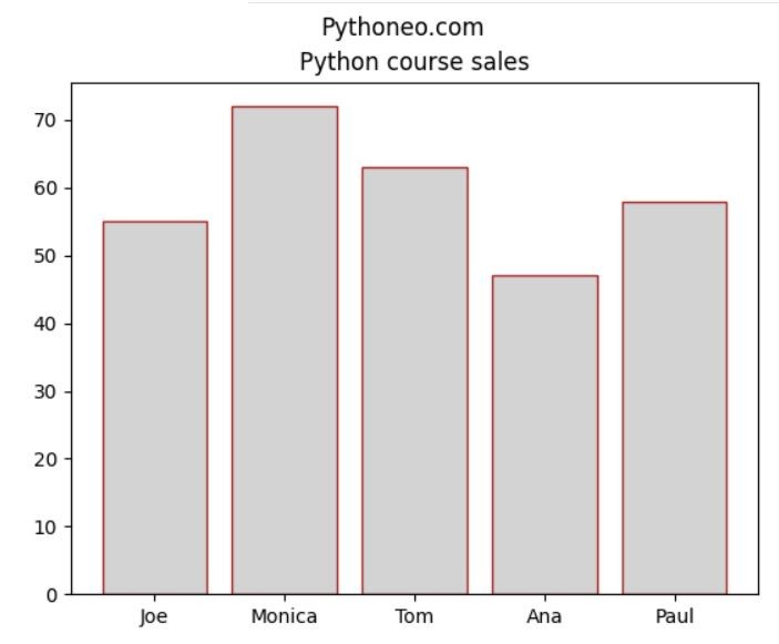
To create a bar chart in Matplotlib, I need data. I have a list of salesman and number of product_sold.
There is a bar function which creates a bar chart. As arguments, I use salesman as x values and products_sold for y values, among other optional parameters. I chose lightgray for the bars fill color and brown for their edge colors, where ec represents edge color.
import matplotlib.pyplot as plt

products_sold = [55, 72, 63, 47, 58]
salesman = ['Joe', 'Monica', 'Tom', 'Ana', 'Paul']

plt.bar(salesman, products_sold, color='lightgray',ec='brown')

plt.title('Python course sales')
plt.show()
This is how my bar graph looks like. I can improve it even further using more bar function arguments. Matplotlib offers various customization options, allowing you to further enhance the appearance of your bar chart based on your specific needs.