
Seaborn is a powerful data visualization library in Python that provides beautiful and easy-to-use interfaces for creating a variety of plots. One of the most common types of plots used in data visualization is a scatter plot. A scatter plot is a type of plot that displays the relationship between two variables. You will see how to create a scatter plot in Seaborn using the sns.scatterplot function on the built‑in tips dataset, mapping total_bill to the x‑axis and tip to the y‑axis for restaurant tipping analysis.
Let’s first go over some of the important concepts that you should know.
Dataset: In order to create a scatter plot, you need a dataset. A dataset is a collection of data points that you want to visualize. In Seaborn, you can load an example dataset or use your own custom dataset. In this tutorial, we will use the example “tips” dataset that is provided by Seaborn.
X-axis and Y-axis: A scatter plot consists of two variables, the X-axis variable and the Y-axis variable. The X-axis variable represents the independent variable and the Y-axis variable represents the dependent variable. In a scatter plot, each data point is represented as a dot on the plot, with the X-axis value determining the horizontal position of the dot and the Y-axis value determining the vertical position of the dot.
Seaborn functions: Seaborn provides several functions that can be used to create different types of plots. The seaborn.scatterplot function is used to create a scatter plot. This function takes several arguments, including the X-axis and Y-axis variables, the dataset, and other optional arguments that can be used to customize the plot.
Now that we have a basic understanding of the concepts, let’s move on to creating a scatter plot in Seaborn.
Step 1: Importing the required libraries
In order to create a scatter plot in Seaborn, you need to import two libraries: Seaborn and Matplotlib. Seaborn is the library that provides the seaborn.scatterplot function, while Matplotlib is the library that provides the plotting functionality.
import seaborn as sns
import matplotlib.pyplot as plt
Step 2: Loading the dataset
In this step, we will load the “tips” dataset that is provided by Seaborn. This dataset contains information about the total bill and tip size for different meals at a restaurant.
tips = sns.load_dataset("tips")
Step 3: Creating the scatter plot
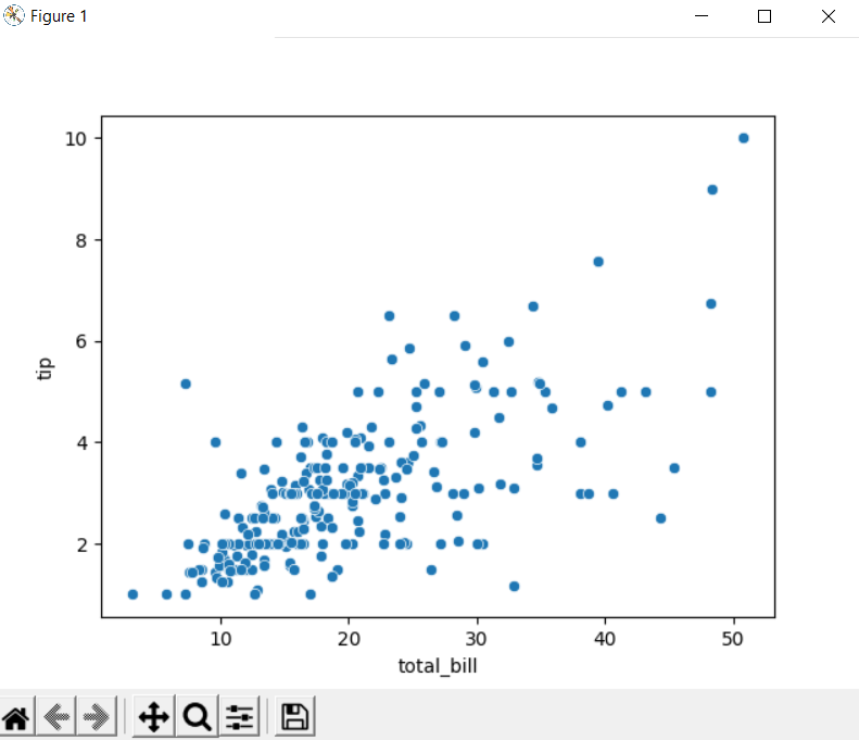
Now that we have loaded the tips dataset, we can create a Seaborn scatter plot of total bill vs tip with sns.scatterplot(x=”total_bill”, y=”tip”, data=tips), leveraging Seaborn’s high‑level API for quick statistical visualizations. The first two arguments that we need to pass to this function are the X-axis and Y-axis variables, which represent the independent and dependent variables, respectively. In this case, we want to visualize the relationship between the total bill and tip size, so we will use the “total_bill” and “tip” columns as the X-axis and Y-axis variables, respectively.
sns.scatterplot(x="total_bill", y="tip", data=tips)
Step 4: Displaying the plot
Finally, we will use the plt.show() function to display the plot.
plt.show()
Here’s the complete code for creating a scatter plot in Seaborn.