
Let’s learn how to plot errorbar using Python library Matplotlib.
Error bars are used to represent the uncertainty or variability of a measurement. They can be used to plot data points with error bars in Python using the Matplotlib library.
Preparation
For start I prepare data and insert common plot.
import matplotlib.pyplot as plt

x = [0.1, 0.2, 0.3, 0.4, 0.5]
y = [1.1, 1.4, 1.7, 1.2, 1.25]

plt.plot(x, y)
plt.show()
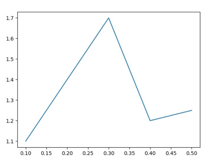
It’s just a common chart. As you can see I have x and y axes populated with values.
Adding errorbar
To plot the error bars, you can use the errorbar() function. The errorbar() function takes the following arguments:
x: The x-coordinates of the data points.
y: The y-coordinates of the data points.
yerr: The error bars.
fmt: The format of the data points.
ecolor: The color of the error bars.
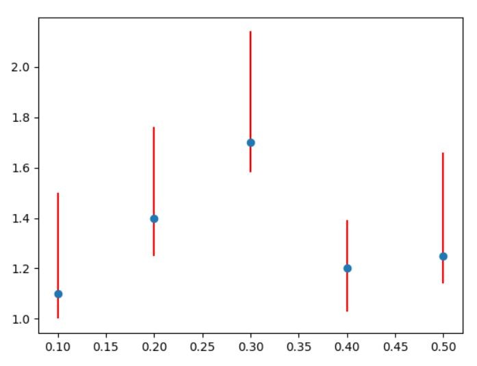
Let’s add error. My measurements are not accurate so some errors may occur.
import matplotlib.pyplot as plt

x = [0.1, 0.2, 0.3, 0.4, 0.5]
y = [1.1, 1.4, 1.7, 1.2, 1.25]
error = 0.4

plt.errorbar(x, y, yerr=error, fmt='o', ecolor='red')

plt.show()
I have introduced 0.4 of error. This is how much my values may differ.
To plot errorbar I used errorbar method. Also used some arguments:
– x and y are my values as usual
– yerr is my error
– fmt is formatting and I chose ‘o’ to see my marks as o letters (alternatively you may use x)
– ecolor is the color of my error line and I like red for every error
And this is how my errorbar looks like:
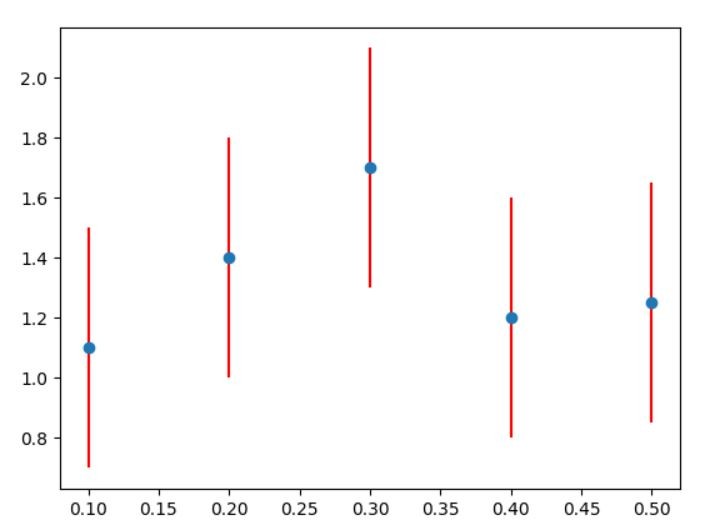
Who told errors has to be the same? You can put different ones for every value.
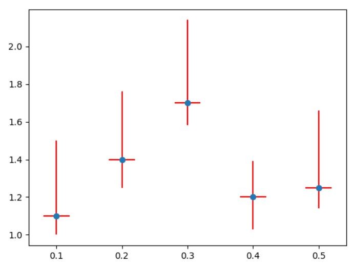
import matplotlib.pyplot as plt

x = [0.1, 0.2, 0.3, 0.4, 0.5]
y = [1.1, 1.4, 1.7, 1.2, 1.25]
error = [0.4, 0.2, 1.1, 0.1, 0.4]

plt.errorbar(x, y, yerr=error, fmt='o', ecolor='red')

plt.show()
As you can see the error of 0.3 is very high.
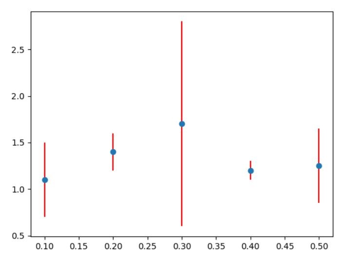
Also you may introduce different values of errors for lower and upper ones. Let’s add min and max values of errors like that:
import matplotlib.pyplot as plt

x = [0.1, 0.2, 0.3, 0.4, 0.5]
y = [1.1, 1.4, 1.7, 1.2, 1.25]

min_error = [0.1, 0.15, 0.12, 0.17, 0.11]
max_error = [0.4, 0.36, 0.44, 0.19, 0.41]
error = [min_error, max_error]

plt.errorbar(x, y, yerr=error, fmt='o', ecolor='red')

plt.show()
I have specified min errors and max errors and defined them under error.
Adding xerr
What if x values are erroneous as well? Then you need to define xerr as well.
import matplotlib.pyplot as plt

x = [0.1, 0.2, 0.3, 0.4, 0.5]
y = [1.1, 1.4, 1.7, 1.2, 1.25]
xerror = 0.02

min_error = [0.1, 0.15, 0.12, 0.17, 0.11]
max_error = [0.4, 0.36, 0.44, 0.19, 0.41]
error = [min_error, max_error]

plt.errorbar(x, y, yerr=error, xerr=xerror, fmt='o', ecolor='red')

plt.show()
You may notice that additional error values appeared for x values.
Now, you should know how to insert plot errorbar chart using Python Matplotlib library.