Skip to content
pythoneo

Pythoneo

Online How to Python stuff

How to insert Pie Chart in Matplotlib?

Posted on July 9, 2021August 7, 2023 By Pythoneo

Let’s learn to insert a pie chart in the Python Matplotlib library. I’ll show you the easiest way.
matplotlib pie chart edgecolor
To insert a chart, we need to prepare the data for visualization.

import matplotlib.pyplot as plt

products_sold = [55, 72, 63, 47, 58]
salesman = ['Joe', 'Monica', 'Tom', 'Ana', 'Paul']

I imported matplotlib and prepared a list of salesman and products they sold.

Plt pie

To create a pie chart I need to use pie function and use products_sold as an argument

import matplotlib.pyplot as plt

products_sold = [55, 72, 63, 47, 58]
salesman = ['Joe', 'Monica', 'Tom', 'Ana', 'Paul']

plt.pie(products_sold)
plt.show()

This is the first version of pie chart.

new empty matplotlib chart

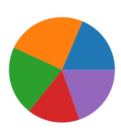
I like it but it needs a few improvements because it is not very useful.

Plt title

Let’s start from adding a title with title function.

import matplotlib.pyplot as plt

products_sold = [55, 72, 63, 47, 58]
salesman = ['Joe', 'Monica', 'Tom', 'Ana', 'Paul']

plt.pie(products_sold)

plt.title('Python course sales')
plt.show()

matplotlib pie chart title

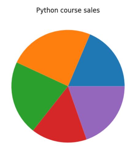
Title is here. Now let’s add labels.

Adding labels

To add labels I added labels as an additional parameter to pie function. I set salesman as a list of labels.

import matplotlib.pyplot as plt

products_sold = [55, 72, 63, 47, 58]
salesman = ['Joe', 'Monica', 'Tom', 'Ana', 'Paul']

plt.pie(products_sold, labels=salesman)

plt.title('Python course sales')
plt.show()

matplotlib pie chart labels

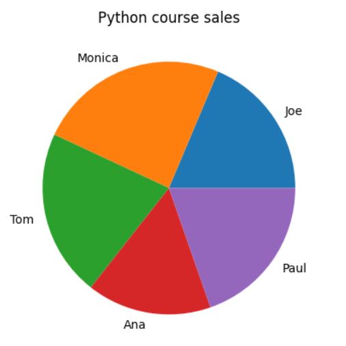
It is getting better. Now at least I know what is this pie chart about.

Adding values

Next thing I need are values.

To add values I used autopct argument. To define the format of my values I used %.0f%%’ because I can see digits without decimals (0 decimals).

import matplotlib.pyplot as plt

products_sold = [55, 72, 63, 47, 58]
salesman = ['Joe', 'Monica', 'Tom', 'Ana', 'Paul']

plt.pie(products_sold, labels=salesman, autopct='%.0f%%')

plt.title('Python course sales')
plt.show()

matplotlib pie chart autopercentage

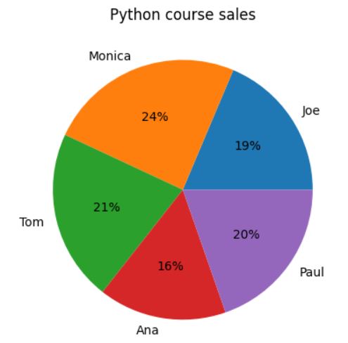
With autopercentage I can see the first basic version of pie chart I can see.

See also  How to use matplotlib cmap?

Define an explode

Still it is not enough for me. I’d like explode the sales of Monica. To explode a slice of pie chart in Matplotlib I need to define explode list first. 0.2 is how much it needs to be exploded. Then I added explod parameter to pie function.

import matplotlib.pyplot as plt

products_sold = [55, 72, 63, 47, 58]
salesman = ['Joe', 'Monica', 'Tom', 'Ana', 'Paul']

explode = [0, 0.2, 0, 0, 0]

plt.pie(products_sold, labels=salesman, autopct='%.0f%%', explode=explode)

plt.title('Python course sales')
plt.show()

matplotlib pie chart explode slice

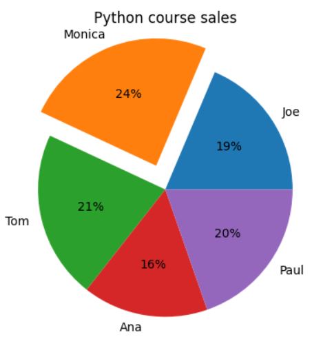
A slice is exploded out now.

Adding a startangle parameter

I’m still not very pleased with the chart. Exploded slice is too close to the chart’s title. I’d like to move the chart a bit counterclockwise. Adding startangle parameter with value of 20 does the job.

import matplotlib.pyplot as plt

products_sold = [55, 72, 63, 47, 58]
salesman = ['Joe', 'Monica', 'Tom', 'Ana', 'Paul']

explode = [0, 0.2, 0, 0, 0]

plt.pie(products_sold, labels=salesman, autopct='%.0f%%', explode=explode, startangle=20)

plt.title('Python course sales')
plt.show()

matplotlib pie chart startangle

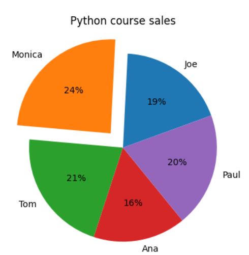
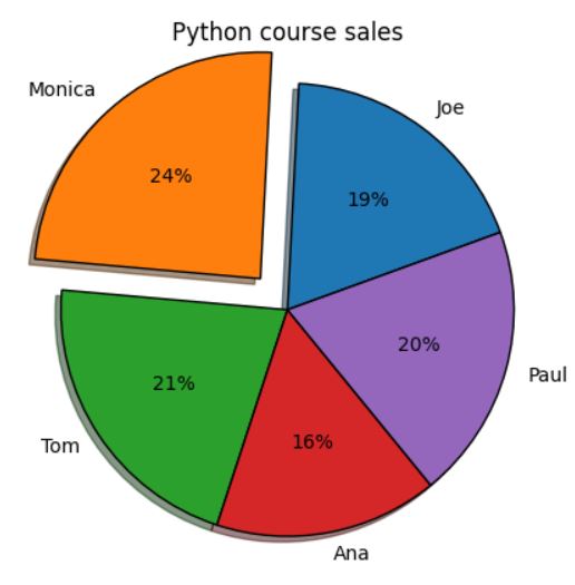
This is much better! What can I do to make it more beutiful?

See also  How To Use Colormaps In Matplotlib?

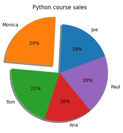
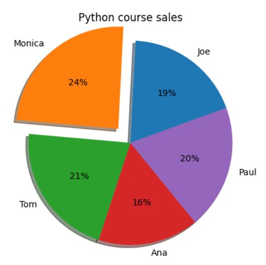
Enable a shadow effect

I’d like to see it more 3D. To do it I need just to enable shadow effect.

import matplotlib.pyplot as plt

products_sold = [55, 72, 63, 47, 58]
salesman = ['Joe', 'Monica', 'Tom', 'Ana', 'Paul']

explode = [0, 0.2, 0, 0, 0]

plt.pie(products_sold, labels=salesman, autopct='%.0f%%', explode=explode, startangle=20, shadow=True)

plt.title('Python course sales')
plt.show()

matplotlib pie chart shadow

The radius parameter

If you’d like to enlarge your pie chart you can also do it easily. Radius parameter is responsible for pie chart size. By deafault it is 1. To increase the size by 10% just use 1.1 like that.

matplotlib pie chart enlarge

Also adding edge color would look nice. I’d like to see black. To do it you need to use wedgeprops parameter.

import matplotlib.pyplot as plt

products_sold = [55, 72, 63, 47, 58]
salesman = ['Joe', 'Monica', 'Tom', 'Ana', 'Paul']

explode = [0, 0.2, 0, 0, 0]

plt.pie(products_sold, labels=salesman, autopct='%.0f%%',
        explode=explode, startangle=20, shadow=True, radius=1.1, wedgeprops={'edgecolor': 'black'})

plt.title('Python course sales')
plt.show()

matplotlib pie chart edgecolor

My pie chart is ready. I like it a lot. I hope you do as well.

Key Takeaways

To insert a pie chart in Matplotlib, you can use the plt.pie() function.
The plt.pie() function takes a list of values as its argument.
You can also specify labels for the pie chart slices by using the labels argument.
You can use the autopct argument to display the percentage of each slice in the pie chart.
You can use the explode argument to explode one or more pie chart slices.
You can use the startangle argument to rotate the pie chart.
You can use the shadow argument to add a shadow to the pie chart.
You can use the radius argument to increase or decrease the size of the pie chart.
You can use the wedgeprops argument to specify the properties of the pie chart wedges, such as the edge color.

See also  How to create a BarPlot in SeaBorn?

FAQs

Q: What is the difference between a pie chart and a bar chart?
A pie chart is a circular chart that shows the relative sizes of different parts of a whole. A bar chart is a rectangular chart that shows the values of different variables along a single axis.
Q: When should I use a pie chart?
You should use a pie chart when you want to show the relative sizes of different parts of a whole. For example, you could use a pie chart to show the percentage of students in a class who passed an exam.
Q: What are the limitations of pie charts?
Pie charts can be difficult to read when there are a lot of slices. They can also be difficult to compare different pie charts if they have different sizes.

matplotlib Tags:chart, pie

Post navigation

Previous Post: How to Plot Errorbar Charts in Python with Matplotlib
Next Post: How to Calculate the Determinant of a Matrix in Numpy

Categories

  • bokeh (1)
  • Django (5)
  • matplotlib (11)
  • numpy (99)
  • OpenCV (4)
  • Pandas (3)
  • paramiko (12)
  • Pillow (3)
  • Plotly (3)
  • Python (30)
  • Scipy (4)
  • Seaborn (7)
  • statistics (7)
  • Tkinter (8)
  • turtle (2)

RSS RSS

  • OpenCV FindContours: Detecting and Analyzing Objects in Images
  • How to create a simple animation in Tkinter
  • Adaptive Thresholding with OpenCV
  • Hot to use the grid geometry manager in Tkinter
  • How to install and use paramiko for SSH connections in Python
  • How to automate file transfers with paramiko and SFTP
  • How to Execute Remote Commands with Paramiko and SSHClient
  • Handling Paramiko Errors and Timeouts
  • How to use paramiko with multiprocessing and threading
  • How to use matplotlib cmap?

Tags

arithmetic mean array axis button calculations chart column conversion count data type dictionary dimension draw error files fill float generate grid GUI image index integer list matrix max mean min mode multiply normal distribution plot random reshape rotate round rows size string sum test text time type zero

Copyright © 2023 Pythoneo.

Powered by PressBook WordPress theme

We use cookies on our website to give you the most relevant experience by remembering your preferences and repeat visits. By clicking “Accept”, you consent to the use of ALL the cookies.
Cookie settingsACCEPT
Manage consent

Privacy Overview

This website uses cookies to improve your experience while you navigate through the website. Out of these, the cookies that are categorized as necessary are stored on your browser as they are essential for the working of basic functionalities of the website. We also use third-party cookies that help us analyze and understand how you use this website. These cookies will be stored in your browser only with your consent. You also have the option to opt-out of these cookies. But opting out of some of these cookies may affect your browsing experience.
Necessary
Always Enabled
Necessary cookies are absolutely essential for the website to function properly. This category only includes cookies that ensures basic functionalities and security features of the website. These cookies do not store any personal information.
Non-necessary
Any cookies that may not be particularly necessary for the website to function and is used specifically to collect user personal data via analytics, ads, other embedded contents are termed as non-necessary cookies. It is mandatory to procure user consent prior to running these cookies on your website.
SAVE & ACCEPT
Go to mobile version