
Plotly’s animation features let you turn a static time series into an evolving story where the plot moves frame by frame.
An animated line chart is especially useful when you want to highlight how trends develop over time or how multiple series diverge from a common starting point.
Instead of providing several static snapshots, you can give the user a slider and a play button to explore the timeline interactively.
Structuring Data For Animation
Plotly animations rely on the concept of frames, where each frame represents one step in time or one state of the data.
The most convenient way to structure the data in Python is to use a tidy Pandas DataFrame with one column for the time variable, one for the metric, and one for the category or series name.
Plotly then groups rows by time and builds frames automatically when you specify the frame argument in the figure.
import numpy as np
import pandas as pd

np.random.seed(42)

years = np.arange(2015, 2026)
countries = ["Country A", "Country B", "Country C"]

rows = []
for country in countries:
    base = np.random.uniform(50, 100)
    for year in years:
        value = base + np.random.normal(scale=3) + (year - 2015) * np.random.uniform(0.5, 2.0)
        rows.append({"year": year, "country": country, "value": value})

df = pd.DataFrame(rows)
print(df.head())
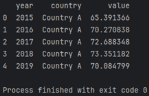
This code builds a synthetic dataset with three countries and a simple upward trend for each one.
Every row stores a single observation for a specific year and country, which is exactly what Plotly needs to construct frames for the animation.
In a real project, you would replace this with your actual metrics such as revenue, user count or any other time series.
Building The Animated Line Chart
The high‑level Plotly Express API makes animated charts straightforward to declare.
You pass the frame parameter to indicate the column that represents time, and Plotly takes care of generating the underlying frames and controls.
The resulting figure offers a timeline slider and a play button by default, which means you get interactivity without custom JavaScript.
import plotly.express as px

fig = px.line(
    df,
    x="year",
    y="value",
    color="country",
    animation_frame="year",
    animation_group="country",
    markers=True,
    title="Animated line chart of metric by year"
)

fig.update_layout(
    xaxis_title="Year",
    yaxis_title="Metric value",
    legend_title_text="Country"
)

fig.show()
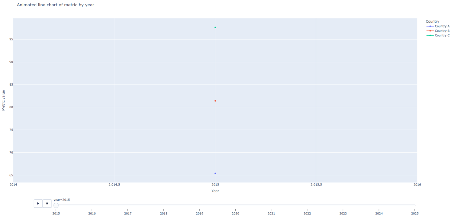
The animation_frame argument tells Plotly which column defines the steps, while animation_group ensures that each country is treated as a continuous series across frames.
Markers on the line improve readability, especially when the chart is paused on a specific year.
With just a few lines, you have an animated figure that works in notebooks, web apps and exported HTML files.
Improving The Animation Experience
After the basic figure is working, you can refine the animation controls to make the story smoother.
Two common tweaks are adjusting the frame duration and easing function, and tightening the axis ranges so that the chart does not rescale with every step.
Stable axes give viewers a consistent frame of reference while the lines move.
fig.update_layout(
    xaxis=dict(range=[df["year"].min(), df["year"].max()]),
    yaxis=dict(range=[df["value"].min() - 5, df["value"].max() + 5])
)

fig.layout.updatemenus[0].buttons[0].args[1]["frame"]["duration"] = 500
fig.layout.updatemenus[0].buttons[0].args[1]["transition"]["duration"] = 300

fig.show()
With a longer frame duration, each step of the animation becomes easier to follow, and a shorter transition keeps the movement responsive.
Manually setting axis ranges prevents distracting zooming effects as values change across the timeline.
These small adjustments often make the difference between a flashy demo and a chart that genuinely supports analysis.
Exporting And Embedding Animated Charts
When you are satisfied with the animation, you can export the figure to an HTML file and embed it in your website or documentation.
Plotly writes a self‑contained HTML document that includes the necessary JavaScript assets, so the interactive controls work without a separate server.
This makes animated charts a practical choice for blogs, dashboards and static documentation pages.
fig.write_html("animated_line_chart.html", auto_open=False)
You can link directly to this file or integrate it into a larger web project through an iframe.
In web frameworks such as Django or Flask, the exported HTML fits naturally into template‑based views.
Because everything runs in the browser, readers interact with the animation even if they never install Python.