
Learn how to plot logarithmic values using Python NumPy and Matplotlib libraries with step-by-step examples.
How to Plot Logarithmic Values in Python Using NumPy and Matplotlib
To create logarithmic plots in Python, you’ll need to import the NumPy library for logarithmic calculations and Matplotlib for data visualization.
Using Numpy, Python can efficiently create an array and calculate the logarithmic values of its elements.
The Matplotlib library is then used to plot the logarithmic values.
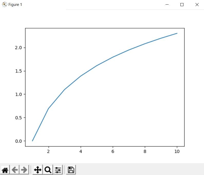
import numpy as np
import matplotlib.pyplot as plt

my_array = np.array([1, 2, 3, 4, 5, 6, 7, 8, 9, 10])

logarithm = np.log(my_array)
plt.plot(my_array, logarithm)
plt.show()
In this example, np.log(my_array) computes the natural logarithm (base e) of each element in my_array. The plt.plot(my_array, logarithm) function then generates a line plot where the x-axis represents the original values from my_array, and the y-axis displays their corresponding natural logarithms. This type of plot is useful to observe the logarithmic relationship between the original data and its transformed values.
Matplotlib also offers different types of logarithmic plots that can be highly beneficial depending on your data and visualization goals. For instance:
plt.semilogx(x, y): Creates a semi-logarithmic plot with a logarithmic scale on the x-axis and linear scale on the y-axis, ideal for exponential data visualization.
plt.semilogy(x, y): Creates a plot with a linear scale on the x-axis and a logarithmic scale on the y-axis.
plt.loglog(x, y): Creates a plot with logarithmic scales on both the x and y axes.
You can customize logarithmic plots using Matplotlib functions including titles (plt.title()), axis labels (plt.xlabel(), plt.ylabel()), legends (plt.legend()), grid lines (plt.grid()), and styled markers to enhance visualization clarity.