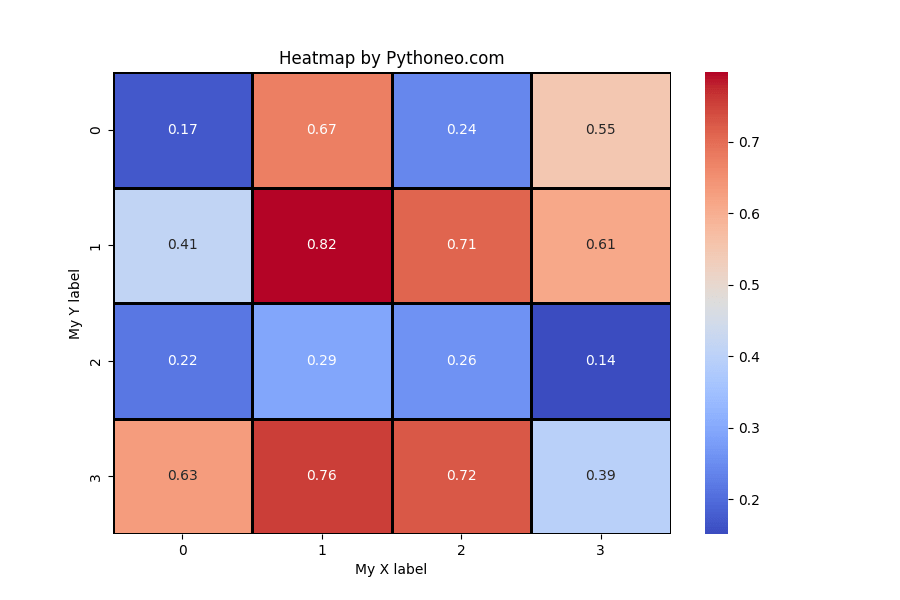
Learn how to create heatmaps in Seaborn with annotations, color maps, clustering, and data visualization.

You may need heatmap chart when you want to see fluctuations of two categories. Heatmap are useful for visualization of two-dimentional data.
To create a heatmap you will need to import Python modules like: Seaborn, Matplotlib, Numpy and Pandas. It depends on your setup and the source of your data. I am going to generate the data so I don’t need Pandas which would be useful when you are taking the data from external source like csv file.
import numpy as np
import seaborn as sns
import matplotlib.pyplot as plt
This is how I’m generating the data.
my_random_data = np.random.rand(4, 4)
It’s just to have data to work with.
I’m going to define the data sets to show in the heatmap, create subplots and set the size of the chart.
f, ax = plt.subplots(figsize=(9, 6))
Sns heatmap
Let’s jump to the core heatmap definition.
ax = sns.heatmap(my_random_data, annot = True,
                 cmap = 'coolwarm', linecolor = 'black',
                 linewidths = 2, robust = True)
I’m going to save my heatmap as a png picture.
f.savefig('My heatmap.png')
To see the heatmap I need Matplotlib show method. This is not mandatory as I’ve already saved my Seaborn heatmap as a png picture.
plt.show()
My Seaborn heatmap is almost ready. It requires just some polishing. I need to name my chart and labels to improve the visibility.
ax.set_title('Heatmap by Pythoneo.com')
ax.set_xlabel('My X label')
ax.set_ylabel('My Y label')
The heatmap is ready.

Heatmap code
That’s the full code:
import numpy as np
import seaborn as sns
import matplotlib.pyplot as plt

my_random_data = np.random.rand(4, 4)
f, ax = plt.subplots(figsize=(9, 6))
ax = sns.heatmap(my_random_data, annot = True,
                 cmap = 'coolwarm', linecolor = 'black',
                 linewidths = 2, robust = True)
ax.set_title('Heatmap by Pythoneo.com')
ax.set_xlabel('My X label')
ax.set_ylabel('My Y label')
f.savefig('My heatmap.png')
plt.show()
